What is this thing called welfare spending?
Here's a chart that illustrates something which is relevant both to welfare and public finance, two of this blog's pet subjects. I want to use it as a way of opening up the question: how much does 'welfare' for people of working age cost and how has this changed over time? We hear a lot of assertions about these issues from politicians and commentators. But what is 'welfare', and what is 'welfare spending'? These are not the same question.
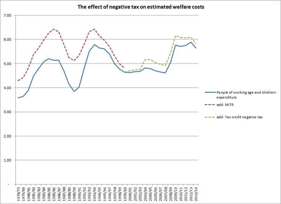
To explain what the chart shows, I need to clarify some terminology. The title of the chart uses the word 'welfare'. That term actually has no strict meaning within the UK's public expenditure control system, unlike for example 'social security'. It belongs essentially to a political vocabulary. So when people say 'We're spending X billion/Y % of GDP' on 'welfare' there's a certain amount of creative leeway, which invites all kinds of obfuscation- for example, as to whether pensions are included or not. I'm using the term creatively as well, but I'll try to avoid obfuscation. In what follows, pensions and benefits to pensioners are excluded.
'Public expenditure' in contrast does have a strict meaning. It refers to money which the government spends, having extracted it from taxpayers (mostly) or borrowed it. What it /doesn't/ refer to (in the UK system) is money the government chooses not to collect, by foregoing tax revenue through selective tax reliefs, exemptions, allowances and so on. So if we ask how much the government spends on welfare, or anything else, we are implicitly ignoring the costs government incurs by foregoing revenue through selective tax measures. This creates a problem, because some elements in the cost to the Exchequer of what is commonly referred to as 'welfare' represent tax revenue foregone rather than spending. That's why the title of the chart refers to the 'cost' of welfare rather than 'welfare spending', although it shows the latter as well (the blue curve).
The most high profile example of foregone revenue within welfare concerns tax credits. For many families, tax credits take the form of an offset to income tax liability rather than a cash transfer. This is commonly referred to as the 'negative tax' component in tax credits, and it is far from being trivial: about £3bn in 2012/13 according to DWP. This obviously shouldn't be counted as 'welfare spending' but it does contribute to the total cost of 'welfare'- if it wasn't for the reduction in tax liability, the government would have more money to spend on other things. The dotted green curve on the chart shows welfare spending plus the negative tax component.
But if we include this foregone government revenue in estimating the cost of 'welfare', and it is routinely included in statements by government politicians, we should surely be consistent. If one form of 'negative tax' is included in the 'welfare' total, we should be including all negative taxes which directly affect the distribution of personal income.
So for example, the very large annual costs of private pension tax relief - £21.6bn in 2012-13 - are not counted as 'expenditure', still less as 'welfare', although these costs dwarf those of many welfare programmes (compare housing benefit: £17.3bn) and the benefits are unequally distributed, so that there is substantial redistribution towards those with larger pension pots. This isn't 'spending', but is it 'welfare'? Similar questions arise regarding National Insurance relief on employer contributions to registered pension schemes (£9.2bn). Childcare support through Working Tax Credit is 'welfare', but tax breaks to support childcare (£800m and set to rise) aren't. Some of the cost of the late, lamented Child Trust Fund was 'welfare' as government was a net contributor to the fund, but tax reliefs for Individual Savings Accounts (£1.7bn) aren't. (Data on tax reliefs and expenditures here http://www.hmrc.gov.uk/statistics/expenditures.htm )
When government foregoes tax revenues on a selective basis, this is equivalent to providing a subsidy to the household type, income group, behaviour, economic activity, commodity, asset class or whatever which is being treated favourably. The economic effects and thus the final distribution of benefits may vary of course, depending on the design of the subsidy - but this applies to spending programmes as well (consider the frequent, albeit usually unevidenced claims, that tax credits are really a subsidy to employers) . If we really wanted to understand the mechanisms by which government influences the distribution of income, we would treat all selective tax reliefs on the same footing as other subsidies, although this would be a daunting task, not least because foregone revenues tend, notoriously, to be considerably less transparent than government spending.
It's frequently claimed that 'welfare spending' in the UK is at unprecedented levels, and that there was a 'structural' increase in spending under the previous government - that is, independent of the effects of the financial markets crisis. Expect to hear these claims reiterated endlessly in the run up to this summer's spending review, in which the Chancellor intends to announce some sort of 'cap' on welfare spending. As the blue curve on the chart shows, neither claim holds for working age welfare spending, which was at similar levels after the crash and in the mid 1990's, and which fell and then remained remarkably stable under Labour up to 2008/9. Including the negative tax element of tax credits changes the picture slightly, raising the cost (not spending) at the peak to 6.16% of GDP compared to 5.76% at the previous peak. There is also a largely temporary bulge in costs around 2003/4, with the introduction of child and working tax credits to replace the previous working families and disabled person's credits. If you include negative tax, it looks as if the claim of a structural shift (again, in costs, not spending) stacks up, although this still left costs in 2007/8 (the last pre-recession year) lower than in 1996/7 by about 0.5% of GDP.
But what about other forms of tax relief? To illustrate why this is important for time series comparison, the dotted red curve shows working age welfare spending augmented by the cost to the Exchequer of Mortgage Interest Tax Relief (MITR), which was abolished in 2000 and which the Major government had begun phasing out in the mid 1990's. As housing benefit, a subsidy to renters, is included in the 'welfare spending' total, it makes sense to include MITR, a subsidy to homeowners with mortgages, in the 'welfare costs' total.
Inclusion of just this one form of tax relief dramatically changes the historical picture of costs. At its peak in 1990/91, MITR was subsidising homeownership to the tune of 1.33% of GDP, while working age housing benefit was costing 0.5% (at its highest level, it has never exceeded 1.1% of GDP). Despite the dramatic rise in housing benefit spending in the late 1980's (some of which was in fact a rerouting of existing expenditure rather than an additional cost to the Exchequer http://www.newstatesman.com/business/2013/03/rise-housing-benefit-driven... ), the cost of the homeownership subsidy was far higher. If, as seems reasonable, we include this personal subsidy in the working age welfare costs total as well as the negative tax element of tax credits, then the points where working age welfare was costing UK governments most were 1985/6 and 1993/4, 6.4% in both years compared to 6.16% in 2009/10.
The chart is just intended to illustrate a problem in assessing the costs of welfare: a comprehensive time series would need to include other forms of tax privilege, such as the old married couples tax allowance, and ideally would include estimates of the redistributionary effect of many other forms of tax relief. Some of these elements will be progressive in effect - as seems to have been the case with MITR, by the way, at least if we ignore its role in underpinning council house sales. Some will be regressive: it's well known that tax reliefs sometimes have distributional effects which voters would be very unlikely to find acceptable if they took the form of overt income transfers rather than disguised subsidies.
Mancur Olson noted many years ago 'the current orthodoxies of Left and Right assume that almost all the redistribution of income that occurs is inspired by egalitarian motives and goes from the nonpoor to the poor. In reality, many if not most of the redistributions that take place are inspired by entirely different motives, and most of them have arbitrary rather than egalitarian impacts on the distribution of income- more than a few redistribute income from lower to higher income people.' ('The Rise and decline of nations' p.174). The assumption that welfare spending = redistribution = less income inequality underpins much of what is said about all three, on all sides of the political debate, but the equation is simply wrong.
As a comprehensive account of all the mechanisms through which UK governments have engaged in income redistribution over time is unlikely to emerge in the near future, it is better when discussing welfare to focus on the expenditure side, especially when looking at trends. On that basis, there has been no structural increase in the level of aggregate working age welfare spending for a very long time, since the late 1980's I would argue. Not that I expect the coalition to acknowledge this point, as the idea of a structural increase under the previous government seems to be an article of faith for both parties http://www.leftfootforward.org/2010/07/the-paradoxical-stability-of-welf... . Still, a government that boasts about taking lower income workers out of income tax might at least consider the perversity of citing a measure which had precisely that effect (the negative tax element of tax credits) as a contributor to 'out of control' welfare costs.
Data on MITR costs here http://www.hmrc.gov.uk/statistics/mortgage.htm#2 DWP benefit expenditure statistics, which now include tax credits, here http://statistics.dwp.gov.uk/asd/asd4/index.php?page=expenditure Money GDP from HMT here http://www.hm-treasury.gov.uk/data_gdp_fig.htm Some MITR costs will be accounted for by pensioners, but I don't know of a data source that breaks the cost down by age group and I'm assuming the great bulk of costs went on supporting working age mortgages. There may also be an element of public expenditure in the MITR total, and again I don't have a source that allows this to be separately identified over the whole period: that doesn't really affect the argument of this article, although it means the chart title may not be absolutely accurate.
Update 8 June 2013
I've now located the relevant data series in the National Accounts (The Blue Book). Public expenditure on tax credits and reliefs (i.e. the expenditure side, not the negative tax side) is shown in the secondary distribution of income accounts for central and local government. Mortgage Interest Relief at Source (MIRAS, as MITR was called from the mid 1980s) is classed as a tax credit by ONS. Like our current tax credits, it was available as a cash transfer to people whose tax liability was lower than their entitlement. Negative expenditure is excluded, both for MIRAS and current tax credits. The resulting series is shown here http://labourlist.org/2013/06/labours-welfare-cap-is-a-largely-symbolic-... , which includes pensioners' benefits unlike the chart in this article. We can either focus on the expenditure side in a consistent way (as in the LabourList article) or include the negative expenditure items in a consistent way (as this article tries to do). Either way, we wind up with a similar story on trends.