Is government really going to send this nonsense to all taxpayers?
I don't know whether HMRC has yet started sending out the 'tax summaries' which have been widely reported and commented on over the last couple of days. The table here shows why, if they haven't, it would be a good idea to pulp them and start again.
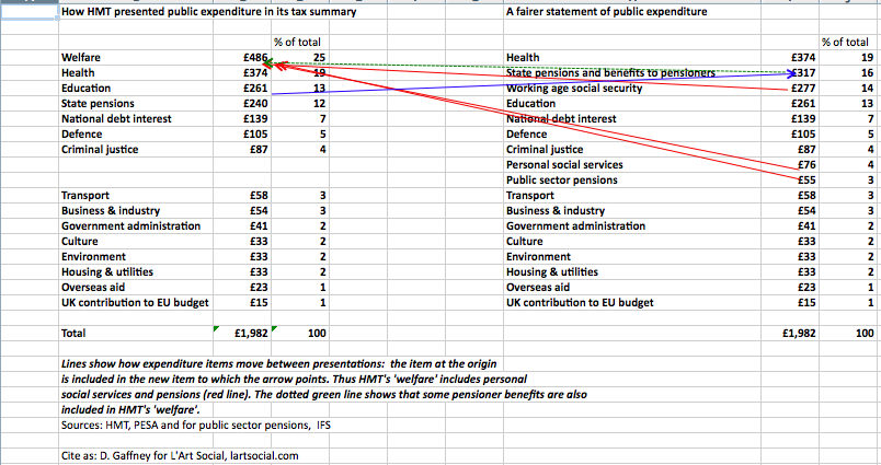
Something has gone terribly wrong in the breakdown of public spending, with a figure of 24.5% given for a 'welfare' category which has no meaning whatosever in UK public finance reporting and which towers over the next spending head, healthcare, at only 19%. The chart here gives part of the story as to how HMT arrived at this figure, by lumping together working age benefits, tax credits, public sector pensions, social services such as care of the elderly and a substantial chunk of benefits for pensioners - while, by showing the state pension as a separate category, giving the false impression that more was spent on other benefit recipients than pensioners.
(That's only part of the story: there's another layer involving the misguided use of a reasonably consistent but occasionally tricky data framework (the international Classification of the Functions of Government, COFOG), due to incompetence, misjudgment or or a conscious choice to blow smoke in the public's eyes.)
The left hand side of the table shows how, in one of the stylised summaries published on Monday, government presents the breakdown of expenditure, expressed in terms of a tax and national insurance liability of £1,982. The right hand gives the same data but in what I think is a fair presentation. As you can see, the ranking of expediture categories at the top is different: healthcare is clearly the largest item, followed by pensioners' benefits. Lines and arrows show the links between the two presentations: you can follow public sector pensions and social services on their journey right to left, to wind up in HMT's analytically useless bin of 'welfare' (which seems to be no more than COFOG social protection minus state pensions). The green dotted line represents the share of pensioners' benefits destined for the same place. A blue line running in the opposite direction shows where state pensions appear on the right hand side. Working age social security is basically the sum of DWP benefits (plus Northern Ireland equivalents) child benefit and tax credits for people of working age and children. I've used the IFS's percentages for social services and public sector pensions http://www.ifs.org.uk/publications/7424 to calculate the cash amounts on the right hand side (with some minor cosmetic tweaks at the first decimal place to make the total come out the same as in government's example).
There are all kinds of interesting conceptual and technical issues around the very idea of providing an account of public spending tied to a personalised tax statement, which I might write about tomorrow. But HMT's account is not defective because of this sort of analytical difficulty. It's defective because it's wrong. Government is apparently spending £5m on this exercise in tax transparency. If transparency rather than misinformation is the objective, it should be prepared to write off the entire amount if necessary and get back to the drawing board.