Median income in 2011/12 lower than in 2001/02
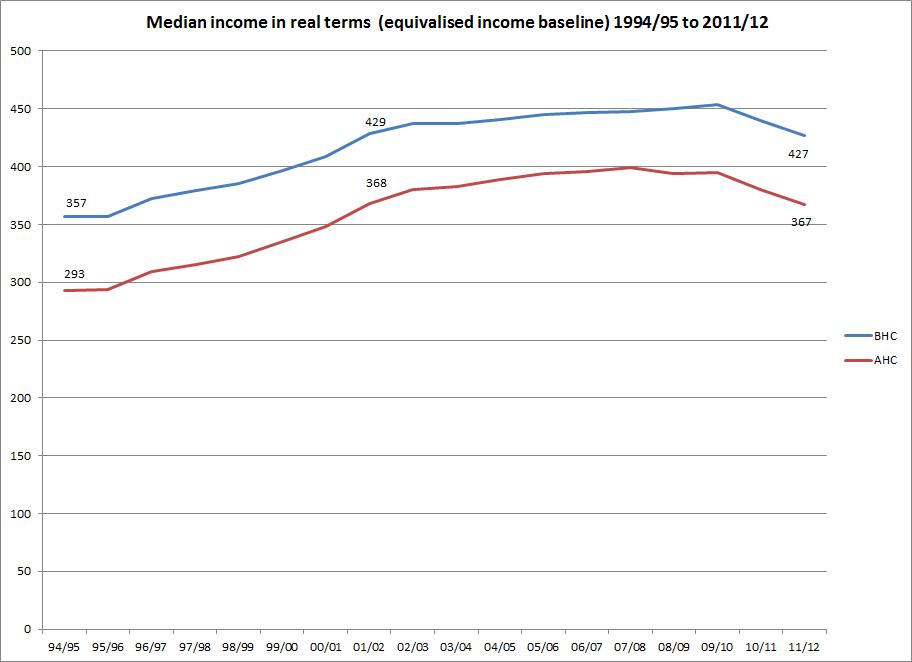
A quick chart based on today's Households Below Average Income publication http://research.dwp.gov.uk/asd/index.php?page=hbai Real terms median income is shown before and after housing costs from 1994/5 to 2011/12. The median is slightly lower in 2011/12 than in 2001/02 on both measures.
The fall in the median between 2010/11 and 2011/12 means that today's child poverty figures are somewhat more grim than the headline rates suggest. The relative poverty threshold is 60% of median income, so other things being equal, when median incomes fall (which they rarely do, or so we used to think) relative poverty reduces. The child poverty rate fell by one percentage point before housing costs, and remained stable after housing costs. With the median falling at this rate, we might have expected a larger fall, as happened between 2009/10 and 2010/11 with an almost identical fall in median income leading to a two percentage point fall in poverty. What this boils down to is that families with children were faring worse in 2011/12 than in 2010/11, contrary to what the headline rates indicate, but consistently with the substantial rise in 'absolute' poverty measured against a fixed income threshold also shown in today's figures.
There's been no change for working age adult poverty and a one percentage point fall for pensioners, but only before housing costs. (Note that these figures relate to poverty rates- percentages- not numbers of people in poverty.)
The data is from table 2.4, which is a time series of the equivalent money value of various income measures (median, mean, 60% median = poverty threshold) for different family types. HBAI uses an equivalised income measure which adjusts cash incomes to reflect household size and composition. The baseline (equivalisation factor =1) is income for a couple family with no children, which is what's shown in the chart. All that means is that this is the unadjusted population median income.The same data is in table 2.1ts.