Income inequality 1961-2011/12
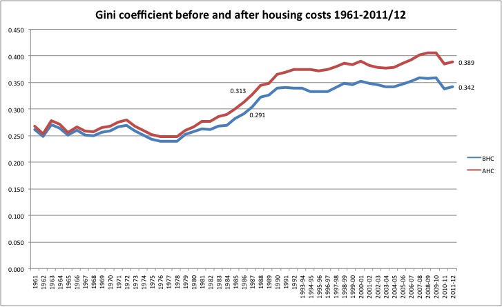
Gini coefficients before and after housing costs from 1961, courtesy of the IFS http://www.ifs.org.uk/fiscalFacts/povertyStats I've knocked this chart together in response to a tweet from Alex Andreou, according to which the PM has claimed that inequality is at its lowest level since 1986. That's not the case on this data, nor on any of the ten other inequality measures on the IFS's spreadsheet, so I've no idea what the PM is on about. [Update 21 March 2014: I've tabulated the various meansures here https://twitter.com/djmgaffneyw4/status/446962875827879936/photo/1]
Update 22.06
Well, now thanks to ONS and various tweeps I do know what the PM was on about. He was referring, it seems, to a table in ONS's 'Effect of taxes and benefits on household income' http://www.ons.gov.uk/ons/publications/re-reference-tables.html?edition=... , published July, which shows a - not 'the'- Gini coefficient which was indeed at its lowest point since 1986 in 2011/12.
Now the first thing to note is that this is not the Gini coefficient which is usually cited in discussion of inequality, and which is charted in this article- usually referred to by nerds as the HBAI measure after the annual 'Households Below Average Income' publication in which it is published. This has caused some confusion on twitter, with a couple of respected journalists both obviously assuming that what the PM had cited was 'the' Gini coefficient. A Gini coefficient is a mathematical measure of inequality or dispersion in whatever variable you choose to apply it to. The PM has indeed cited a Gini: it's just that it's not the one that they seem to think he was citing, and it's not one I have ever seen cited in political debate in the many years I've worked in this area.
What's the difference between the PM's Gini and the one the rest of us have been using forever? Partly, that it uses a different data source to the HBAI measure, and partly- and more importantly in this context I think- it refers a different unit: households rather than individuals. In the HBAI measure we are seeing how living standards (proxied by income) vary across the population. In the ONS figure cited by the PM, we have a measure of how living standards vary across households.
Why are these measures sending conflicting signals? Well consider the fact that household size varies with position in the income distribution. In the bottom 10% of households, average household size is 2.17. In the middle, it's 2.38 while at the top it's 2.29. So there are more people in the middle of the /household/ income distribution than at either extreme, and more people at the top than at the bottom. Obviously, the number of people in each decile in the /individual/ income distribution is the same. So it's not surprising if the Ginis for the two distributions vary. And it's not surprising if we should see them drifting further apart as the housing squeeze leads to changes in household size and composition, as is quite clearly happening.
I have no quarrel with the ONS household measure: I'm not saying it's in any way less correct than the HBAI. They measure different things. I do think that from a population welfare perspective, the individual measure is clearly preferable. But the important thing is that people realise that the PM's statement today turns on selecting a measure which is not normally cited in order to make a claim which is simply incorrect on the measure which is normally cited, as well as on ten other measures of inequality.