Stagnation may be worse than we think
Over on the TUC's indispensable Touchstone blog Richard Exell charts household consumption expenditure, using the latest release from ONS which takes us up to the last quarter of 2012 http://touchstoneblog.org.uk/2013/03/stagnation-charts-1/ It's essential to look at household spending as well as income, because the two don't necessarily move together, even over quite extended periods. During the pre-recession boom, expenditure grew much faster than income, which was largely stagnant: since 2008, households have been running down debt meaning that such income growth as there has been (and there has been some) isn't necessarily fully reflected in household consumption. This has important implications both for aggregate demand, and thus the prospects for the economy, and for households' living standards. Arguably, there are political implications as well: the fact that households are restraining their own consumption in order to pay down debts run up during the boom is surely likely to influence public attitudes towards government borrowing and austerity- irrational as this may seem to economists.
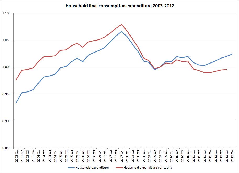
Richard's chart shows that expenditure in 2012 Q4 was about the same as in 2010 Q1 (in fact it's very slightly higher, but the difference is almost invisible). He writes 'Remember that household consumption accounts for about 63 per cent of GDP and that it made a major contribution to recovery from the 80s and 90s recessions. Since the end of 2010/early 2011 it has only flattered to deceive: this is what stagnation looks like.' I agree, but I'm not sure the data doesn't somewhat understate the problem. After all, it does show household spending on an upward path from the third quarter of 2011 throughout 2012. The coalition could reasonably claim this as evidence that its policy stance is working.
Things look rather different if we take demographic change into account. The UK has seen significant population growth since 2010. As I and many others have pointed out before http://lartsocial.org/record , demographic change explains most of the growth in employment we've seen over the last year. It also seems to explain a lot of the growth in household spending. We can see this by comparing total expenditure with spending per head. The red curve on the chart shows expenditure on a per capita basis (indexed to the second quarter of 2009, as that is the reference year for both data series). Unlike the aggregate spending data, this is only available up to the third quarter of 2012. Nonetheless, we can see that the curve in the first three quarters of 2012 is a lot flatter than the aggregate spending curve. While aggregate spending in 2012 Q3 is about the same as in the first quarter of 2010 or -what comes to the same thing- the third quarter of 2006, we have to go back to the last two quarters of 2003 to find per capita spending at the same level as 2012 Q3 (ignoring the quarters immediately preceding 2012 Q3).
Subject to the caveats at the foot of this article, it looks as if such growth in household spending as we have seen since 2011 is primarily a reflection of population growth. This is bad news for the economy and - at least in the short term- for households' living standards. It will be interesting to see what the 2012 Q4 figures scheduled for release on 16 April show: we may see a lagged impact from the growth in disposable income in the first two quarters of 2012. In the meantime, the very weak increases in per capita household expenditure that we've seen offer little comfort to the coalition. If we are on the road to recovery- and it is far from clear that we are- it is looking to be a painfully slow journey.
[The data on per capita spending is here http://www.ons.gov.uk/ons/rel/hsa/the-economic-position-of-households/q3... Some caveats: the two series don't contain exactly the same components- as far as I can see, the only difference is that spending by Non-Profit Institutions Serving Households (NPISH) is included in the per capita data but not the aggregate data, but there could be other differences I haven't spotted. ONS's report shows that NPISH makes very little contribution to per capita spending growth in 2012. It's not clear (to me) whether the per capita data is seasonally adjusted, while the aggregate spending data is. And as usual, all figures are subject to revision, including the demographics underpinning the per capita figures.]