Benefit cuts and the London rental market: the difference between 'very big' and 'infinite'
This is the first of three posts about the impact of the changes to housing benefit introduced in April 2011 on private renting in London- more precisely, changes to Local Housing Allowance, as HB for the private rented sector has been called since 2008.
There are well-founded worries that these changes will have a major impact on the social geography of the capital, with lower-income families being forced out from Inner London to suburban areas in Outer London. After all, the private rented sector accommodates some 25% of the capital's households, and about 200,000 families have seen a reduction in the support they are entitled to. Moreover, the private rented sector is massively concentrated in Inner London, which has more than half of all renting households in the capital compared to only 28% of owner-occupiers- and where rents are substantially higher than in Outer London.
At the same time, there are reasons to suspect that the impact of the restrictions will be as much on household incomes as on location- if not more. I'll discuss the arguments on either side- with no ambition to adjudicate between them- in the next two posts, but here I want to set out some basic facts about LHA in London, looking at the (mostly) pre-reform period July 2010 to June 2011 and focussing on where LHA tenants live and the availability of cheaper accommodation (cheaper by London standards, that is).
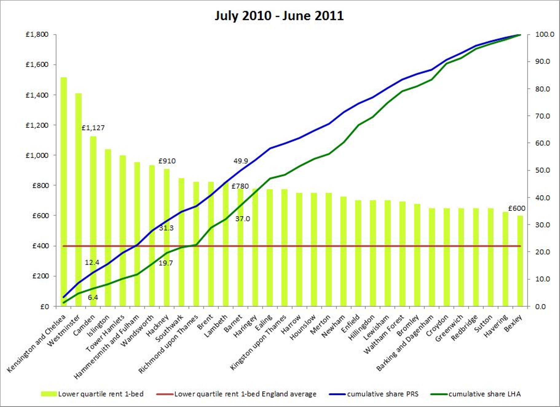
The chart at the head of this piece represents my attempt to get as much information into one place as is feasible without it becoming completely incomprehensible. It's not quite as complicated as it looks. In the background the greenish-yellow columns show monthly rents for for the cheapest 25% of one-bed flats, by London borough. The boroughs are arranged left to right in descending order according to the rent level, so think of the left-right dimension as representing the (falling) cost of private rented accommodation. The average rent for the cheapest 25% of one-bed flats for England (£407) is shown by the red line. Even the cheapest borough in London, Bexley, costs nearly £200 more per month than the England average. Bear in mind that we're looking at the lower end of the rental market.
The blue curve shows the cumulative share of all privately renting households (for all sizes of accommodation) as we move from left to right (from more to less expensive). This means that for each borough, the corresponding point on the curve shows the percentage of households which are in areas where rents are /at least as high/ as in that borough. So half of all privately renting households are in boroughs which are at least as expensive as Barnet, where the average low-end rent is £780, nearly twice the England average. Nearly a third (31.3%) are in areas where the rent is at least £910 a month, which is 2.25 times the England average. And about 12% live in the three central London boroughs - Westminster, Kensington & Chelsea and Camden- where even the bottom 25% of rents for one-bed flats are well over £1,000 a month. Another way of putting this is in terms of the private rented stock in London: half of all the available accommodation is in areas where the cheapest 25% of one-bed flats cost £780 a month or more (sometimes considerably more).
Even cheap rents in London are not exactly cheap. This is not /necessarily/ a problem: wages are higher in London, and over the medium term, it is wages that drive rents, not rents that push up wages. But the distribution of wages needs to be taken into account- the London earnings premium tends to be higher for those with higher wages- along with the fact that at the moment we are seeing a surge in rental market inflation in London which has little to do with rising wages and a great deal to do with the seizing up of mortgage lending to first time buyers, pushing up demand for rented accommodation. And of course many tenants don't have any wages at the moment and are entirely reliant on the benefit system to keep a roof over their heads, while a still-increasing number of households have been pushed into reliance on LHA due to falling real wages and reduced hours of work.
Where do tenants receiving Local Housing Allowance live? The green curve shows, again, the cumulative share as we move from the most expensive to the cheapest boroughs, and the main point of this chart is the gap between the green curve and the blue curve, which shows, broadly, how much less likely LHA tenants are to live in more expensive areas. For all we have heard over recent years about irresponsible LHA claimants living in desirable areas that 'hardworking families' could never afford, only 6.4% of claimants are in the three hyper-expensive central boroughs- note that this is /before/ the effect of the government's restrictions on LHA. And while a half of the available rented accommodation in London is in areas where low-rent one-beds cost £780 a month, only 37% of claimants are in these areas.
So LHA tenants were under-represented in the more expensive boroughs, and over-represented in the cheaper boroughs, before government cut their support. The scale of this under/over-representation isn't really clear from the chart, and we need to turn to statistics. I've entered what is essentially the same data as is shown in the chart into a multiple regression model: the results can be read as simply summarising the data in a useful way, or as testing a hypothesis about how claimants respond to rent levels. For the moment, let's take them as purely descriptive.
We want to see how much the number of claimants in an area responds to rent levels taking account of the availability of accommodation.The dependent variable is (the log of) the local LHA caseload and the independent variables are (logs of) the lowest 25% of local one-bed rents and the size of the local private rented sector. The results can be interpreted as the percentage impact of a 1% change in each of the dependent variables on the number of claimants. For this period, the effect of a 1% increase in rents is to reduce the LHA caseload by 1.7%, while a 1% increase in the private rented stock increases the caseload by 1.3%. So both factors have a very substantial influence on the number of LHA claims, with rents being the more important factor. The model 'explains' (in a statistical sense) two thirds of the variation in the LHA caseload between boroughs.
In short, the location of LHA tenants in London is largely a function of rent levels and the available rented stock. This is hardly surprising- moving away from the purely descriptive level, a common sense hypothesis would be that claimants tend to live in cheaper accommodation subject to its availability. The alternative hypothesis which underpins just about everything the current and previous government have said about LHA since 2009 is that LHA tenants are pretty much indifferent to rent levels. This is obviously not supported by the data here, or by much more detailed research http://research.dwp.gov.uk/asd/asd5/WP85.pdf. (Those who insist that LHA claimants are indifferent to costs seem to think, bafflingly to me, that /that/ is a common sense theory which doesn't need evidential support.)
The responsiveness of the LHA caseload to these factors flags up one of the arguments about the impact of government restrictions to the benefit. If tenants are already concentrated in cheaper areas, once we take account of the availability of private rented accommodation, as they clearly are, then their options for moving elsewhere in response to cuts to support will be correspondingly limited. The London rented market is huge, but it isn't infinite, and LHA tenants were already located in those parts of the market we would expect them to be in before April 2011. I'll return to this in the next piece, which will look at the post-reform period.
Sources: Rents data is from the Valuation Office Agency; LHA caseloads from the Single Housing Benefit Extract via DWP StatXplore; privately renting households from Census 2011. Regression using Wessa, P. (2013), Free Statistics Software, Office for Research Development and Education, version 1.1.23-r7, URL http://www.wessa.net/