UK income distribution 1961-2010/11
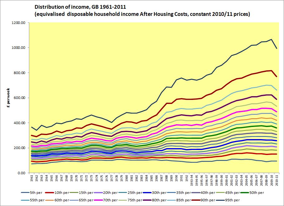
This chart is a by-product of some other work I've been doing. It shows the income distribution, broken down into 5% intervals, from 1961 to 2010/11. I don't think it demands a great deal of commentary. Taking the 50 year period as a whole,income growth was greater the higher up the income distribution: but that pattern really only kicks in the mid-1970's, prior to which differences in income growth were less marked and less consistently related to position in the distribution. Note that incomes are in constant prices, so the chart documents real terms change.
Data is from the Family Resources and Family Expenditure Surveys, as collated by the Institute for Fiscal Studies for their project with Joseph Rowntree Foundation and Nuffield College Oxford, 'Ongoing trends in inequality'. The data is downloadable here http://www.ifs.org.uk/projects/127 in Excel and comes with a useful explanatory note.