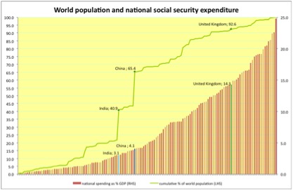
Social security expenditure as a share of GDP in global perspective

Data from the ILO social security database on non-healthcare social protection spending as a share of GDP, for 145 countries for which this data is available. The green curve (using World Bank population data) shows the cumulative share of the world population as we move from low-spending to high-spending countries (strictly speaking, of this part of the world's population as we don't have data for all countries- however, the ones we do have data for account for the great majority of the global population). This allows us to say for example that 65% of the world's population live in countries in which non-healthcare social spending accounts for 4.1% of GDP or less and about 7% are in countries spending more than the UK at 14.6%. European welfare states dominate the high spending end of the range as might be expected, but you'll have to take my word on this as it's obviously impossible to give labels for all 145 countries. (Note that while the population curve is cumulative, the spending data isn't- so the chart doesn't tell us anything directly about the Merkel/Osborne soundbite about Europe accounting for 50% of world welfare spending http://www.ft.com/cms/s/0/8cc0f584-45fa-11e2-b7ba-00144feabdc0.html#axzz... , though it certainly makes it look plausible.)
Three caveats. Sub-Saharan African countries are under-represented in the data, and tend to have low expenditure, so there should be more countries towards the left-hand end of the axis. Non-healthcare social protection spending will include items that most people would not classify as social security, notably public sector pensions, which are an important component of this spending in many countries. And the spending data is from various years: this is an imperfect representation of what we can expect to be a rapidly changing picture. GDP per capita and the population share of retired people play the major role in explaining these variations, and both of these are rising in many countries, including India and China (17% and 19% of the world's population respectively). We can expect the global picture to change a lot over coming decades.
Update: using the same data plus GDP estimates (for 2005) for the same countries, the European share of this spending would be about 53%, so I don't think the Merkel/Osborne soundbite is likely to be far off. However, I would query whether it is telling us anything interesting or useful. We already knew that European countries are very rich and have very high life expectancy.