Visualising intergenerational workless households with dependent children (updated)
Left-click to enlarge image.
“Our recent Housing Poverty report concluded that Britain’s social housing estates, once stepping stones of opportunity, are now ghettos for our poorest people. Life expectancy on some estates, where often three generations of the same family have never worked, is lower than the Gaza Strip” – Iain Duncan Smith MP (2009)
How many of these intergenerational workless households are there? There's an excellent account of the data on intergenerational worklessness by Lindsey MacMillan and Paul Gregg here http://inequalitiesblog.wordpress.com/2012/02/21/never-working-families-... But I thought it would be interesting to experiment with visualisations of the data.
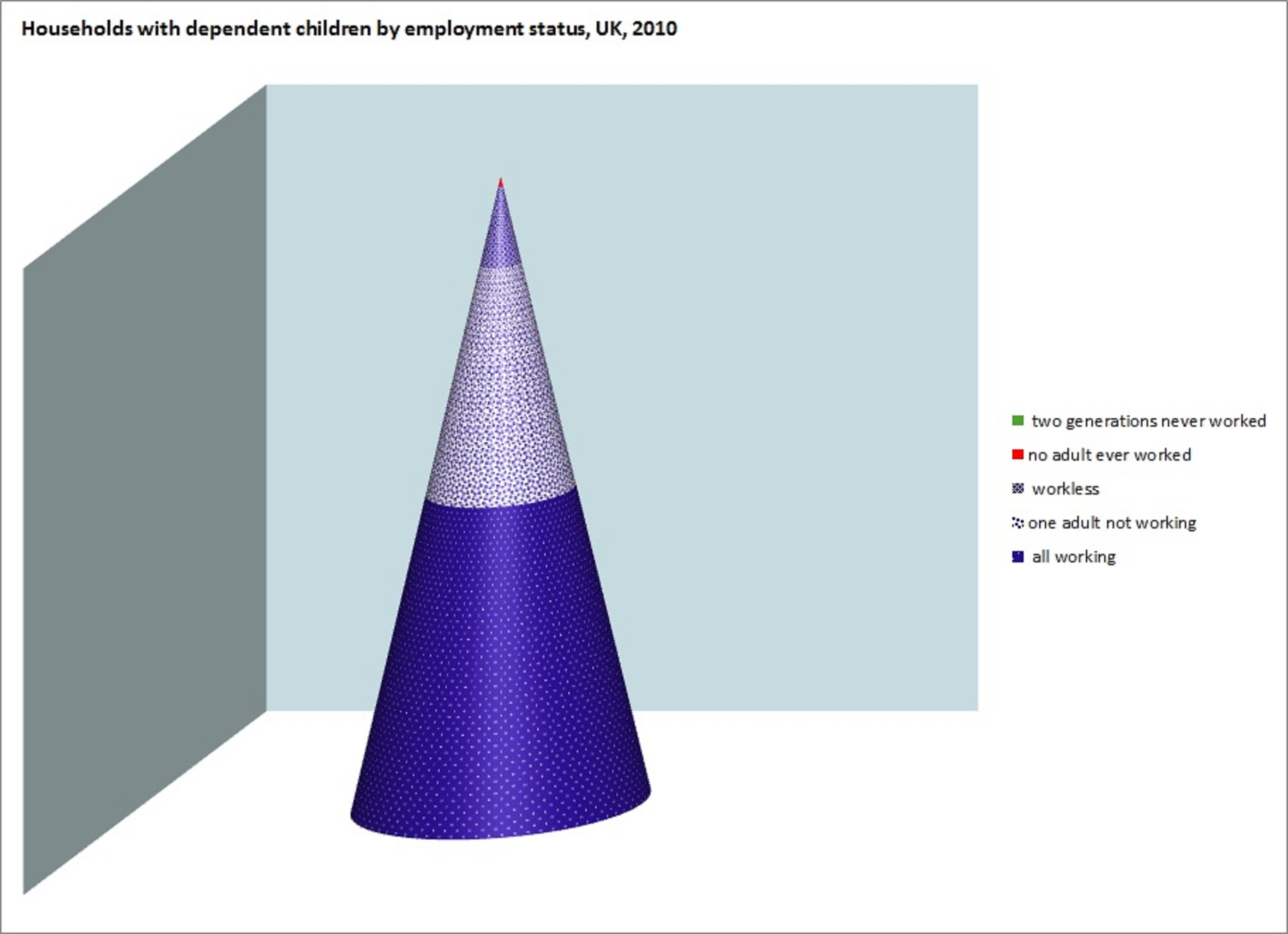
The chart shows how households with children break down between the categories all working, some not working, workless, never worked, two generations never worked as of 2010. Except it doesn't really show the last category, because after many frustrating attempts I gave up on finding a formatting option which would make the category visible. You'll just have to take my word that it's there.
Thanks to Chris Goulden for prompting this.
[Update: a new chart because the scale on the earlier one was misleading and some of the values were slightly out. Data is from ONS's 2011 publication http://www.ons.gov.uk/ons/rel/lmac/working-and-workless-households/2011/... (data for 2010) supplemented by the spreadsheet to which this Left Foot Forward article http://www.leftfootforward.org/2010/09/the-myth-of-the-intergenerational... links. Despite updating and I think improved formatting, the intergenerationally workless category remains invisible to the naked eye.]