Those households again
A lot of people seem to have liked the cone chart on intergenerationally workless households with children I published earlier http://lartsocial.org/cone2 , but I've noticed a problem with it. The volumes in the chart aren't proportional to the variable being displayed, which is the number/percentage of households falling into the various categories. For example, about half of households with kids have all adults in employment. This is the category at the bottom of the chart. But it's obvious that the volume of the section in question is a lot more than half the total volume of the cone. In fact, this isn't really a three-dimensional chart at all, it's a standard column chart disguised as something else, and the only dimension of the chart that counts is the height. When I created the chart, I naively assumed it was structured in the obvious way.
In terms of presenting the data we gain nothing from this format apart from emphasis, and lose in terms of the risk of the data being misunderstood. The basic point the chart was making is valid- households with kids where there are two generations who have never worked are extremely rare, on the verge of statistical non-existence - and a cone is a very nice way of getting this across. But until I find a way of charting this so that the volumes are proportional to the variables, I'd rather present the data a different way. (There's a good polemic about pseudo-3-dimensional Excel charts here http://peltiertech.com/WordPress/excel-3d-charts-charts-with-no-value/)
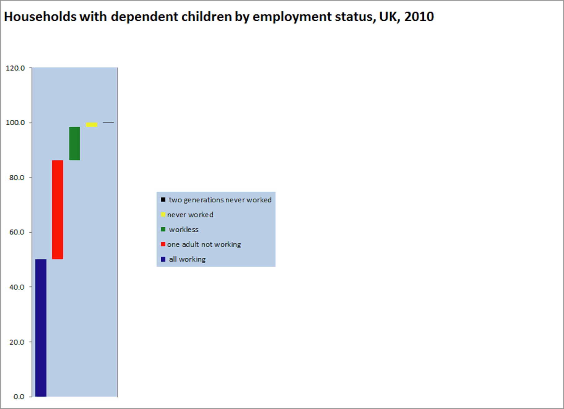
So here's a strictly one-dimensional presentation of what is after all strictly one-dimensional data. The difficulty in presenting all of these figures in one chart is that two-generation never-worked households are so rare that they disappear off the scale, which of course is the whole point of wanting to chart them in the first place. But we can just about make them visible by putting the figures into a column and then splitting the categories into separate blocks (if we didn't do this, the two-generation-never-worked category would just look like a barely-visible border to the next category down).
Unlike the cone, in this diagram we get a reasonably accurate picture of how big the categories are in relation to each other, so for example never-worked households can be seen to be very small in relation to workless households and two-generation never-worked are tiny compared to never-worked. (All of these categories are mutually exclusive in this presentation.)
If you prefer the cone chart, that's fine - just be aware of its shortcomings.