The vegetarian market for foie gras
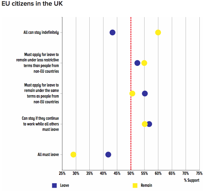
There’s been a lot of confusion and some understandable distress over a forthcoming report from Oxford University and the LSE on attitudes to Brexit, previewed on Buzzfeed. One stylised fact in particular has gone viral: 29% of people who voted Remain in the EU referendum would accept all EU-27 citizens currently resident in the UK being obliged to leave.
This is an example of the sort of factoid which is strictly accurate in a complex, technical sense which is unfamiliar to most people- including many experts- but which, in terms of how it would be understood in ordinary English usage, is completely misleading. Not because the research is in any way flawed but because it has been misinterpreted. The way the results were presented didn't help: the widely-circulated chart below has a natural, intuitive interpretation which happens to be flat-out wrong. People really cannot be blamed for getting the wrong end of the stick and thinking that a significant minority of Remain voters and a larger minority of Leave voters are comfortable with the idea of throwing resident EU migrants under a bus.

To be clear: the research shows that the option of obliging EU-27 citizens to leave is box office poison among the UK public. Leave voters don't like it and Remain voters wouldn't touch it with a bargepole. It would drag down any political platform that included it, however popular the other policies on offer. Most people, Remain or Leave, would be prepared to forego policies they liked rather than accept this option. Of all the Brexit policies for which results were reported in the Buzzfeed article this was the most negatively received. In terms of public approval, expulsion of EU-27 nationals is an absolute stinker.
But that message is, to put it mildly, not obvious. It's roughly the opposite of what people have drawn from the chart. What's going on? There are three crucial pieces of information that people need to know before interpreting the chart. The first is that people were not asked about options in isolation but were given all-or-nothing choice between two bundles of options: each bundle covering a range of issues such as immigration, trade barriers and fiscal contributions. By offering lots of different bundles to a large sample of respondents and randomly varying the composition of the bundles it is possible to build up a picture of how each individual option is evaluated relative to all the rest. 29% of Remain voters didn't choose expulsion, because they were never given a choice on that (or any other individual option): but when given choices involving bundles that included expulsion, 29% of the time they chose those bundles.
That may still not sound completely reassuring. The second point is that the choices between bundles are forced: people can't decide not to choose between bundles- however unappealing both might be. Obviously this is a highly artificial situation. And this brings us to the third point: these results should not be interpreted as telling us directly how people would act in any real-world decision situation.The aim of the exercise is to measure something that can't be directly observed- how people evaluate the various options relative to each other- and the artificial choices they are given are only a means to that end. This explains why saying 29% of Remain voters would choose expulsion is highly misleading. They almost certainly wouldn't- in any plausible real-world situation.
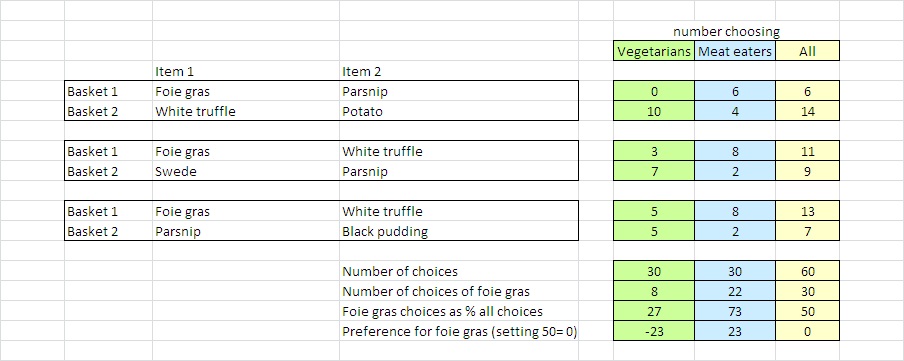
To illustrate this point, consider an imaginary example from the field of consumer choice (which is where the methodology used in this research originates). The example concerns the demand for foie gras among vegetarians. Obviously, there is no such demand. Nonetheless it is possible, at least as a matter of logic and maths, to arrive at a set of results where vegetarians choose foie gras a certain amount of the time in a set-up that mimics the methodology used in the Oxford/LSE research. The table below- which should not be taken seriously, I stress- illustrates one way this could happen. Vegetarians and meat-eaters are chosing between baskets containing combinations of the following food items: white truffles (which everyone loves); foie gras (which most but not all meat-eaters love); potatoes (which everyone likes); black pudding (which meat-eaters don’t like much), swedes (which nobody likes much) and parsnips, which everyone loathes. Assume everybody is already reasonably well-fed so decisions are driven purely by taste.

I've assigned what seem reasonably plausible numbers choosing each basket based on these preferences. Out of 30 choices made by vegetarians, 8 or 27% are for baskets including foie gras. Now if you were in the business of selling foie gras you would not be well-advised to start targeting the untapped vegetarian market based on these results. Vegetarians have chosen those baskets despite the fact that they contained foie gras. Remember, they have to choose- there is no option to walk away from the decision. And the choices they are making are not between individual items- in which case foie gras would obviously never be chosen by vegetarians- but between combinations of items.
The fact that 29% of Leave voters chose bundles which included expulsion is not telling us that 29% of Leave voters favour this option or would choose it in any real world situation. It is not telling us that any would, any more than my thought experiment is telling us that any vegetarian would ever choose foie gras. As the authors have stressed, 29% is a strongly negative result- indeed one of the authors has told me the data is consistent with no remain voters being prepared to accept any trade-off that involved expulsion under any circumstances- which would be stronger than my thought experiment results, where at least some vegetarians were prepared to choose a basket with foie gras.
The way to read the results is as showing how the presence of a particular option in a bundle of options affects the likelihood that people will choose that bundle. The 50% line in the chart represents neutrality: options that are on are near that line could be swapped around between bundles without making any great difference to how often those bundles were chosen. This can be seen as reflecting indifference between the options on the part of participants. If an option scores below the 50% line, the presence of that option in a bundle reduces the chances of its being chosen, and vice versa if it scores above 50%. The difference between a score and 50%, not the absolute value of the score, is the relevant measure of how people evaluate that option compared to the other options. When the score is below 50% people will be prepared to forego options they would otherwise have preferred in order to avoid that option, and the further the score is below 50% the more they are prepared to give up.
For this reason I and others have suggested that the results could be made far clearer with no loss of accuracy by simply setting 50% to 0% (i.e. subtracting 50% from all the scores) so that results which are- in fact, and in terms of the methodology- negative have a minus sign in front of them to signal this. I've done this for the thought experiment results in the last line of the table. This is the line foie gras marketing people would need to look at: it tells them what they need to know. It tells them not to try to sell foie gras to vegetarians.
The authors have now published a detailed blogpost setting out their methodology and clearing up some of the confusion which has arisen from the early publication of partial results. There are no doubt lessons to be learned. One, which really we should all have learned a long time ago, is that when considering publishing a chart or a summary statistic in a highly charged environment, it's a good idea to ask whether there is a politically controversial intuitive interpretation- however implausible- that is likely to suggest itself to readers, and what steps you should take to prevent misinterpretation before it happens rather than trying to deal with it after the event. If no such steps are available, you might want to choose something else to highlight.