Welfare expenditure: where does the money go?
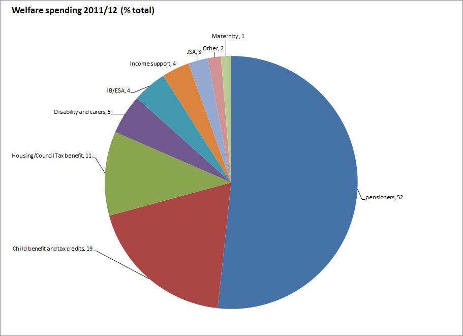
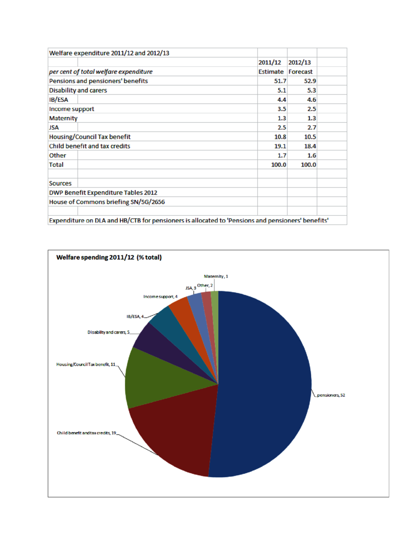
Sue Marsh asked about a pie chart showing how 'welfare' spending breaks down between different categories. I've seen various attempts to illustrate this, but as there is no consistent definition of 'welfare', I decided to start from scratch and pull the data together myself. The PDF shows the results.
I've defined 'welfare' as the sum of DWP benefit expenditure and HMRC expenditure on tax credits and child benefit. There are many different ways of cutting the expenditure figures depending on the focus of interest. I've grouped all benefits to pensioners together, including the housing and disability benefits they receive: this shows that 52% of all 'welfare' spending is on people over retirement age. All of the other figures relate to working age and children only.
I suppose one way of looking at these figures is to divide them into popular and unpopular benefits. Popular benefits (as shown for example in Yougov's polling for Prospect magazine earlier this year) include child benefit and tax credits, disability and carers' benefits and pensioners' benefits, to which we can add maternity benefits, often not even seen as part of the benefit system. Taken together these account for 77% of all 'welfare' spending. The out-of-work benefits and housing/council tax benefit account for 11% each. If this breakdown is a fair reflection of the public esteem in which different elements in the benefit system are held, then most of the money is going on benefits that people seem to approve of. Why they disapprove so much of the other benefits, which after all serve to keep people fed, clothed and sheltered in no great luxury, is a different matter. The forthcoming report 'Benefit stigma in the UK' , which Kate Bell, Ben Baumberg and I were commissioned to write by the charity Turn2Us may throw some light on that question.
Update 5 Jan 2013 The report referred to in last paragraph is here http://www.turn2us.org.uk/PDF/Benefits%20Stigma%20in%20Britain.pdf